Editorial Design
Pages: 600+
Images: 1500+
Software: Adobe InDesign, Photoshop, Illustrator
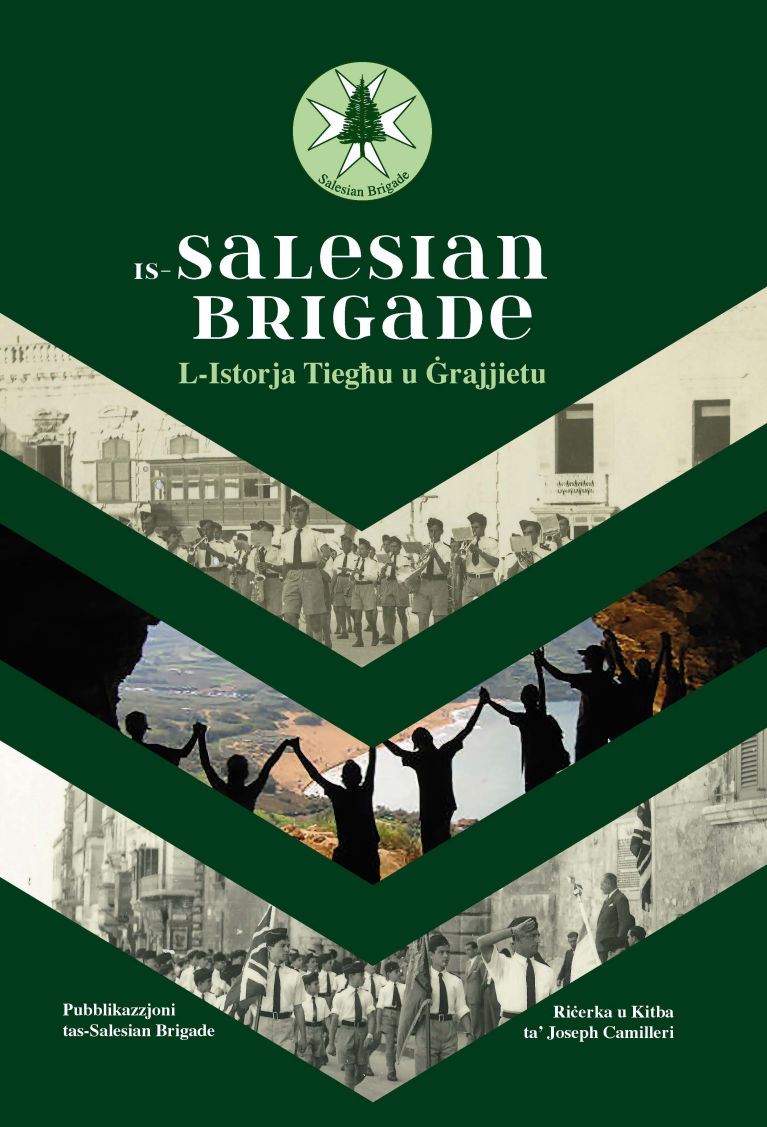
The cover design was inspired by the arrow-shaped uniform detailed featured on the brigade’s shoulder along with a tie to the Maltese Cross which is part of their official logo. The publication documents the history of the Salesian Brigades from their origins to the present day, and the cover needed to reflect the significance of this legacy.
The colour palette is based on the brigade’s official colours, reinforcing its identity and heritage. Inside the book, the arrow motif is reintroduced as a visual element for each chapter opening, creating continuity between the cover and the interior design.
Muted colours were used to distinguish the different chapters. Given the length of the book, this colour-coding system helps readers navigate the publication more easily, allowing them to quickly locate sections or remember where they left off during reading.
01.
Typography and typesetting were carefully planned to maintain a clean, minimal layout while optimising space, allowing the publication to remain contained within a single volume rather than being divided into two.
02.
A palette of muted tones was used to reflect the theme of the publication while maintaining a cohesive and understated visual style.
03.
Image scaling was determined by both the relevance to the accompanying text and the quality of the original material, ensuring clarity while maintaining a balanced and consistent layout.